
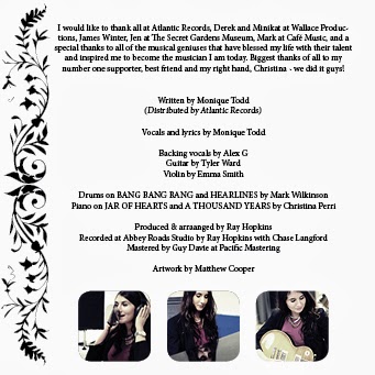


This is the second draft of my digipak. Not much has changed except that I decided to add a translucent image of an orchid in the background on the last page in order to make the space look more realistic and less 'blank'. However after reciving feedback,I feel as if the cover does not match with the theme of the rest of the digipak so I will be looking to use different images and lowering the saturation in order to make it more consistent with the theme of the rest of the digipak.
No comments:
Post a Comment